Quote:
Originally Posted by Drumstix42

I'm not much of a graphics guru when it comes to "good looking design". If you just wanted areas that areas that are always visible, even when you don't have something targeted, it would require dynamic data to be switch around in the window.
|
Actually, graphic minimalism would be preferred. An example is Profits use of redundant target windows. The main ones are shown center top and the primary player window is top left. However you can see the simplistic redundants directly over the hotbar cluster (no implied in this pic).
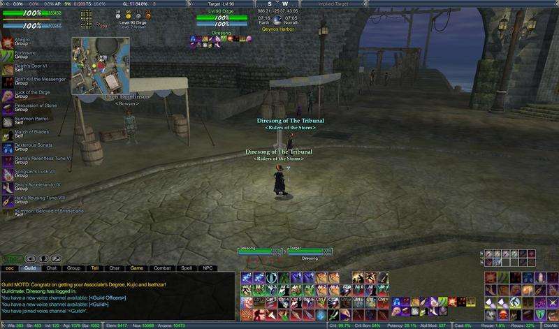
The goal is for people with very large monitors to focus on the "meat-n-potatoes" portion of the UI (hp/power, target, hotbars, detriments) with minimal data clutter. The only difference is they put click-2-cure on the players redundant (not on the primary w/ the concentration slots).