Suggestions
I don't really know how to do much to the UI beyond basic modding but I do have a request...if this awesome idea takes off, please design it with two things in mind: cleanness and function. I prefer a noncluttered, minimalistic look that will take as few resources as possible on old computers (I still sometimes play on my old laptop, for instance.) However I prefer function over style.
I'm not a huge fan of Profit UI due to the looks but man do I love the functionality....especially the broker window. The broker window is a great example of something I'd like to see in this UI; it has lots of info presented at once but you can minimize half of the window via that uber clicky arrow to save screen space if needed! I'd love to see something like this for tradeskills where you could open/close your recipe list via a similar arrow, even while crafting. Other misc ideas: smaller/compact windows (especially raid window, yeesh is that thing big), I'd say include click to cure because most people probably won't figure out what it is until they need to use it anyways...I see enough bad curing healers that I think this training feature is needed in game haha. If I think of anything else, I'll post it later. And also, I might be interested in testing out this UI when it makes it to 'beta' phase hehe. Good luck guys :) |
Not wanting to derail this, but the ProfitUI tradeskill window in fact already has what you are asking. :D
|
Quote:
If we did decide to include click-to-cure (and I'm still on the fence about that one) the upcoming changes to the raid window will at least let us hide that functionality under the advanced mode. I mainly see this as an opportunity to come up with a fresh design and to clean up the UI files removing old styles that aren't used and to better organize the data. Also with the addition of ColorStyles, we can provide an easy method for players to tint the UI on-the-fly giving everyone some different color schemes to choose from. (If it makes sense for the design) |
Unless we just stay srticly with the usabilityonplayer cure command on the OnPress event Im ok with it. But I don't think we should use advanced scripting that is in Fitesh, Profit UI or Henchmans C2 Cure/cast system. Even then I'm thinking it should be hard coded for in-house class detection. Just have the hard coding look at the event properties and if they are populated defer to the user script and not the hard coding.
|
It should not even use useabilityonplayer - the current default UI already has instances of code that don't work for international users (non-ASCII characters in player names), it does not do to introduce more, so this should be fully hardcoded if you even want to go there.
But then there is still the question of which spells to use, and will you do click-to-cure with potions also (in which case you would need to hardcode it also because /use_itemvdl is also buggy if you have items in your non-shared bank)? As much as I agree that it is an essential feature for many players, but if you start adding it to the defaultUI you can't have all the problems that are accepted in custom UIs because that's the best we can do. DefaultUI needs to be better IMHO. Of course fixing all the bugs would be best. ;) |
Yes I agree, that is why I suggested hard coding to just cast cure if the class being played had a cure for said effect. After all these are the 5 detrimental icons we are talking about, so they should strictly just use the class appropriate cure spell. If the user wanted to use potion or other spells/CA they would need to script it them self or look at a 3rd party UI customization.
|
I as a healer think that click to cure is useless. I coded it into my UI because a lot of my friends use it and asked for it. Potions on the player window is huge but I do think that should be left for third party customization. The idea of a a potion bank might be nice but its something I can't imaging being used very much.
I think a huge thing from my perspective is Visions. Being colorblind during raids when I get colored vision its hard for me to tell if at all. If we were given the info for detrimental names we could code custom messages to say YOU HAVE BLAH BLAH! That being said I think names duration and target/who cast should be on detrimental maintained and spell effects. Spell effects should also be split into two windows temporary buffs and ones until canceled buffs, that way seeing item procs or temp buffs is very easy as many of these don't show in maintained. |
Also sorry to double post! I don't think hiding all detrimentals together is a good idea, it should be curse only or all five.
|
Quote:
|
Yep, if you have a stack of 50 potions on you and 10 in the NON-SHARED bank, it will try to use the ones in the bank.
I think this is the realated to the issue of L&L clickly items. If you have one on you and one or more in the bank, and you examine the one on you, it will take one from the bank. |
Alright, I'll throw a new idea or two out on the table:
1. UI file-write capabilities. Imagine being able to edit buttons on say the player window, just like a macro button, and the UI would save this customization. ... Maybe you wouldn't even call this file write capabilities as much as you would call it "custom" variable saving within a UI window. This one has been brought up before: 2. Single-window bag. I honestly believe at this point, with the number of bags and all, that this would be a GREAT option to have available to users. And if it were a toggle like function, it would be even more superior. 3. True custom binds. I'd love to, by config file, or in game... be able to set a custom bind to open windows. Now, the easiest way off the top of my head would be able to bind a key to any command you want. Safe? I don't see why not, you can already do this on the hotbars if you wanted to. But what I mean by "True" custom binds, is being able to set any key you want for any function you want. If I want to open of my 3 custom, non-default windows... I wanna do it at a key touch. How many keys do I have available on keyboard, versus how many keys aren't being utilized. Seriously. It's 2008 :) Lets make with the customization! Didn't mean to be forward there.... just trying to get that last point across :D |
Quote:
server_name_eq2_customuisettings? 2. Agree. With that I think there should be a sort option to sort each item in its own bag, a list instead of icons, and bag minimizing (see SS). The sort options would come like Quest, Armor, Weapons, Poisons, Potions, etc. Also with that, the ability to toggle for it to automatically sort your bags by specified options. This is an example of WAR Online and how they did their bag window, similar to what I'm describing (I hate using examples from other games): 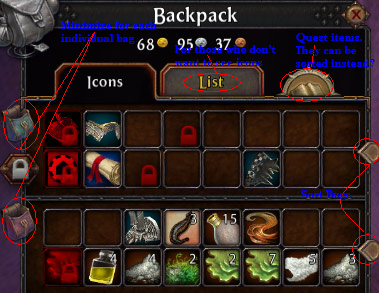 All in one window |
Oh man would I love to have a built in notepad window that saved! I'd make to do lists, lists of masters I still needed, quick things to copy and paste (URLs for example), notes about in game things (how many of fertilizer, water, and bones it takes for a power root), etc. Hugely useful idea. I wouldn't even mind if it was saved on your hard drive...you could add an 'export to desktop' button that saved stuff like friends lists, notes, etc to a file, and you could email it to another comp or transfer it on a USB drive.
While I'm talking about friends lists...please pretty please give us a way to import friends lists or share them between characters :) As for the click to cure thing...I admit I rarely use it myself but that's because I'm an experienced raid healer. I find it much faster to simply use the F keys to target then click in one spot, rather than clicking in 6 different spots. But like I said there are a lot of newb healers out there that just don't cure like they should. I think if there's a satisfactory nonbloated way to include click to cure, it should be put in as a training tool. (Speaking of which I don't remember a tutorial popup explaining what a status effect was or the different ways it can go away. That's a kind of important oversight.) |
Quote:
|
All very good ideas and I agree with most of them. Its just an issue of time. So before this thread turns into more of a wishlist for features, lets keep it on the topic of creating a new UI without having to add too much new functionality. The other things can come when we have time.
I definitely like the idea of a list view for the bag window. I tried WAR for a little while myself and their inventory interface was indeed nice. We've kicked around the idea of allowing you to save data and I think that's pretty doable. It becomes more of a possibility if we convert the UI files from binary into XML. Then we can serialize all of the properties on an object. So if you wrote in script "test=hello", then it could save the property test with the value of hello and automatically be reloaded later. I think this would be a lot harder to implement with the current system. |
Quote:
PS: Since this thread was being derailed so often by all participants I didn't mod it any further than the initial creation, might be easier to make a new thread for on topic discussion (and I could heavily mod that if you want - this topic is bound to always be derailed in a wish list). |
Yeah.. sorry about the derailments. I'll take credit for a lot of it :p
|
Side-by-side journal.
Thoughts? I think most people prefer this over the standard UI's top-over-bottom layout. |
We're kind of getting off topic. We gotta go back to the drawing board and figure out the first steps.
First step: BRAINSTORMING We need a starting ground. Since we'd be developing from "the ground up", here's some logical first step brainstorming topics to discuss (UI graphics/design/features should come later):
I'm sure everything is subject to change due to the future development process, but we need a place to start. |
Quote:
I think the new default should be toggleable, so people who're used to the current default won't get a sudden incompatible change. They've got saved UI settings and a new default UI probably won't be compatible with those settings (windows will need to be different sizes and in different places, for instance). A real ideal would be to extend the UI settings format to hold the settings for multiple UIs keyed by the name of the UI, so when I toggled on the new default UI it wouldn't overwrite or try to use the old UI's settings, it'd create a new section in the UI settings file starting out with it's own defaults. And if I toggled the new UI off, as part of the change of UI it'd load the section for the old UI. If you key it by UI skin name, custom UIs would then do the same automatically so you could change between multiple UIs without your UI settings getting messed up on every change. That'd make it easy for users to try out UIs without the "Oh gods, if I try that and don't like it I'm going to have to re-do all my UI placement again!" factor. Advanced features? They'd be nice and I'd like to see some internal UI support for things like click-to-cure to make them work smoother, but I'm not sure they need to be actually implemented in the default UI. Aim the default UI at the new user who needs the basic functionality while not confusing them with more features than they can grasp, and make it easy and natural to move on to custom UIs that require you to understand more of what's going on to take advantage of all the advanced features. POIs for the new map system would be an example: SOE implemented the underlying support, but left it to projects like EQ2Map to actually provide the POIs and create the full mod. |
Things I would add and windows I would change!
You said to allow for overall color tinting, I would also like to expand that and ask for activated window tinting. Example your activated or current window is color and if its not active its grey scale. Maintained effects: Allow for the icon size to be adjusted under the options menu. Make the black shade for countdown easier to see. Add target information(advanced) Add duration information(advanced) When you hover over the icons area this changes to name of spell Add amount remaining(advanced) Allow for you to toggle the advanced information on and off. Turning advanced information off would make it look the same as it does now. I really don't have a logical answer for this but I think its a huge pain how as a support class probably half your maintained spells are your buffs. Leaving little room for your debuffs, buffs or procs. There should be some way of working this out. More later. Spell effects: Allow for the icon size to be adjusted under the options menu. Make the black shade for countdown easier to see. Give us the information name and duration. Split this window into two windows, one for until canceled buffs or buffs longer than one hour. Another for temporary buffs that way it makes it easy to see procs ect, this is a huge problem. Like I said before the maintained is also very cluttered with the addition of this new window you could move all BENEFICIAL maintained spells here too. Making a new Beneficial window, maintained window(or hostile window), Buff window and detrimental window. Detrimental effects: Allow for the icon size to be adjusted under the options menu. Make the black shade for countdown easier to see. Give us the information name and duration. Hot bars: For the love of god get rid of the spinners! Maybe throw the bank control in hot bar settings since they can still be adjusted with hot keys? Just make a marker of some sort which is your active hot bar! Or just really make it so if you hide the spinner it doesn't have dead space :P Get rid of the border so they can be used as a block. Make the black shade for countdown easier to see. Allow for timers under hot bar settings. Remove the clear all option in the drop down and move it to hot bar settings window. Show timers for items. Chat: Make the tabs more compact. Make the scroll bar hide unless you hover over the window. Target window: Add Percent health and power. Give us the actually health amount pwease :):):) Implied window: Add Percent health and power. Give us the actually health amount pwease :):):) Start button: Get rid of it Compass: Add a small round eq2 emblem to the bottom of it and make it the new start button. Heroic opportunity: Just condense it a tad and cooler graphics. Quest journal helper: Allow for showing multiple quest in a collapsible tree esq thing. Quest journal: horizontal view kind of like explorer. Group window: Allow for the player window to snap into here or make a option to have it be part of the group window all together. Show health and power percents or values. Build pet health into group members. Player window: like I said before snap into the group window. Remove concentration crap that can go into the persona window. Change appearance to mimic the group window. Socials window: Switch macros tab with emotes making it the primary. Allow you to drag the order of macros for reorganization. Raid window: Shrink it a tad. Two modes, show curse and show all five detrimentals. If in a square names should go from the center out. Expanding on that the top two groups should fill from the bottom up and bottom two should fill from the top down. Bags: Have two modes under the options menu all in one or individual. All in one would be the same as if they were just next to each other in a block. Still respect the bag rules and order but appear as one block with the title in the top left(Bags) and the x at the top right. Persona window: EDITED**** All the drop down options just make those visable all the time! There is no reason not to there is plenty of room. That is all I can think of at this late hour couldn't really sleep so decided to get the ball rolling. Hope this is the kind of stuff you are looking for. |
Personally I started using UI's cause I hated not knowing exactly how much I was getting per kill and how close I was to level
Found one UI I liked (Dracokyn) which became outdated and now I am modding it my self for my own purposes and my wifes... how ever someone else has taken up tryingto keep it up todate as best they can. So I would have to say Show me my percents instead of lil bars also I like being able to see all my stats (dps modifier, crit modifier, run speed, haste, and such) in persona not just the main ones (str int sta wis, and resists) |
Almost all of those are shown in your persona...
|
Quote:
Quote:
Quote:
|
Quote:
Quote:
Quote:
A) If you hover over the window it shows you concentration information again. B) If its going to snap into the group window the idea is that they all pretty much look the same. C) The majority of classes couldn't use all their concentration if they tried. Therefor its just an eyesore more than half the time. D) If you cast a spell and don't have concentration it tells you. So in my opion there is PLENTY of ways to know your concentration if you cant just remember it(which you should :P). |
| All times are GMT -5. The time now is 07:43 AM. |
vBulletin® - Copyright ©2000 - 2024, Jelsoft Enterprises Ltd.
© MMOUI